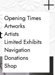
During the design process, I made several assumptions about the target audience and how they would use the app. One of the main assumptions was that many users may be older, so I focused on creating simple navigation that would be easy to understand. I assumed users would want quick access to important information such as galleries, events, donations and artwork details without having to search through complicated menus. Because of this, I used a clear layout and consistent navigation throughout most of the screens.


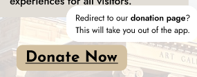
Success for my final design would mean that users can easily move through the app and quickly find information about exhibitions and artwork. I also wanted the app to feel welcoming and modern while still keeping the focus on the artwork itself. Another important goal was encouraging engagement through features such as the events page and donations page, helping users feel more connected to the gallery.
To support my design decisions, I carried out visual research using Pinterest, existing gallery websites and Dribble. These sources helped me understand common layouts, colour palettes and design trends used in creative apps and websites. I noticed that many gallery designs used neutral colours, minimal layouts and large imagery to keep the attention on the artwork. This influenced my own designs, leading me to use a clean and modern appearance with soft neutral colours and organised spacing.
Throughout development, I made changes to improve the overall design. I adjusted layouts and page structures so the app looked less crowded and easier to navigate. I decided to keep the layout simple because it created a cleaner and more professional appearance. Overall, I believe my final design successfully combines accessibility, simplicity and creativity while matching the style expected from a modern art gallery app.
Leave a Reply