I designed the masthead for The Weekend to act as a strong but approachable visual anchor for the magazine. As the publication is aimed at older generations with a specific interest in nature and environmental protection, I wanted the masthead to feel calm, readable, and trustworthy rather than overly decorative or experimental. My user persona influenced me to prioritise clarity and familiarity, ensuring the masthead is immediately legible and appropriate within a traditional editorial context while still feeling contemporary.
During the early stages of the design process, I explored several masthead ideas through sketching and digital experimentation. These early versions tested different typefaces, weights, and layouts, including more decorative and condensed options. However, I found that these reduced legibility or felt unsuitable for the target audience. Through refinement, I simplified the design and focused on a clear typographic solution that better reflected the magazine’s purpose and values.
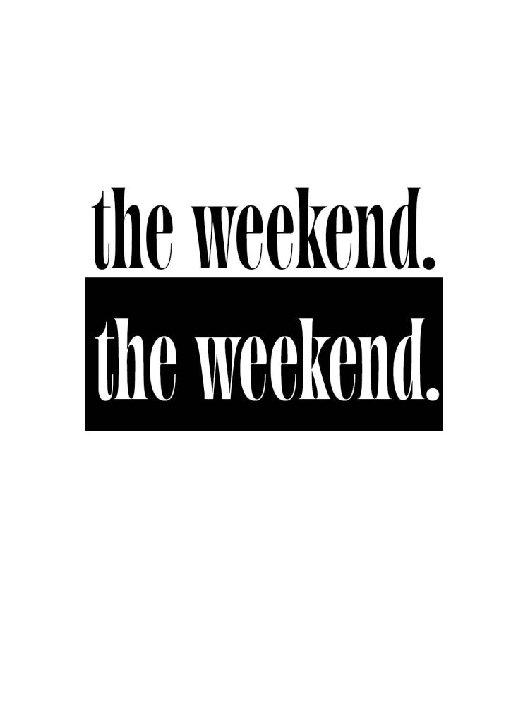
The final masthead uses ‘Aabak Regular’, set at 130pt, as this typeface allows the letterforms to flow smoothly across the page. The rounded forms create a sense of movement, which links conceptually to natural processes and supports the magazine’s environmental theme. This sense of flow is intentionally interrupted by the full stop at the end of the masthead, symbolising the flow coming to a pause as the reader reaches the end of the title. This subtle typographic detail adds meaning without overpowering the rest of the design. The typeface remains clear and legible at a large scale, which is particularly important for the older target audience. I also refined the spacing to ensure the masthead felt balanced and final.
In terms of composition, I kept the masthead horizontally structured and uncluttered to reinforce stability and readability for the audience. This approach also allows flexibility when positioning the masthead over different cover images. The simplicity of the composition ensures the masthead complements the nature photography rather than competing with it.
The masthead colour was deliberately kept to either black or white, depending on the cover image. This decision was made to maximise contrast and ensure legibility against varying photographic backgrounds. Using only black or white also maintains visual consistency across issues while allowing the imagery to remain the main focus. This restrained colour approach supports accessibility and reinforces the magazine’s professional editorial identity.
Overall, the final masthead reflects a considered design process informed by user needs, typographic experimentation, and refinement. By prioritising legibility, the masthead successfully communicates the identity of The Weekend magazine that I created.
Leave a Reply