(Quality and resolution has been reduced to allow me to upload)
For the three The Weekend cover designs, my main conceptual aim was to ensure each cover clearly reflected the theme of the articles within (nature), while still maintaining a consistent brand identity. I treated each cover as a visual introduction to the topic, using colour, imagery, and typography to communicate tone and meaning before the reader even engages with the text.
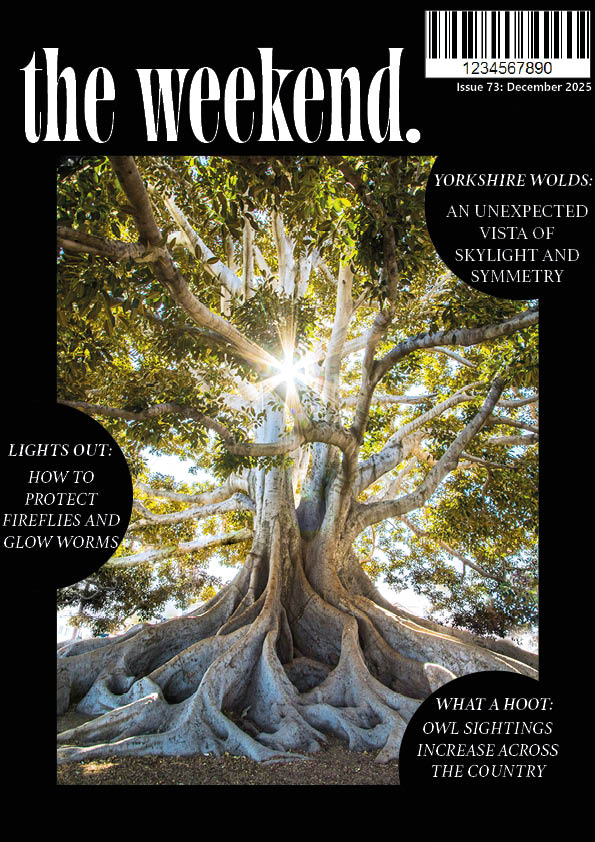
The first cover, featuring a black background, I deliberately chose a dark, minimal colour palette dominated by black which contrasts the lively, colourful image of the tree in the middle. The limited palette allowed brighter elements, such as highlights in the image and lighter typography, to stand out clearly. This is an example of a neutral and green palette, which is more technically described as This contrast strengthens visual hierarchy and draws attention to the main image and masthead first. Conceptually, the darkness creates a serious and slightly mysterious tone, encouraging the reader to engage with the issue. Earlier versions of this cover experimented with more colour, but I refined it by stripping it back, as the restrained palette felt more conceptually relevant and visually impactful.
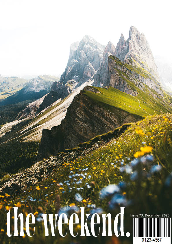
The second cover, featuring a mountain landscape, contains a predominantly green and earthy colour palette to represent growth, land, and environmental health. Greens were especially important as they are commonly associated with nature and sustainability, making the message immediately recognisable. The image-led composition supports this by allowing the landscape to dominate the page. Compared to early drafts, I refined this cover by reducing competing text and adjusting colour balance so the typography remained legible without overpowering the image. This cover is calmer in tone, which reflects the reflective nature of the article content.
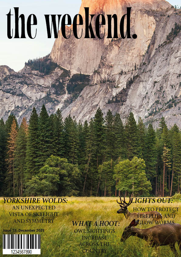
The third cover, featuring deer imagery, focuses on wildlife presence and natural habitats, even within unexpected locations. I chose a warm, brown-based colour palette, which connects to woodland environments and creates a grounded, organic feel. Browns also communicate stability and earthiness, reinforcing the theme of animals reclaiming or occupying space. The colour palette here is softer than the black cover but darker than the mountain cover, allowing it to sit comfortably between the two in terms of tone. Through refinement, I simplified the palette and adjusted contrast to improve readability and ensure the imagery remained the focal point.
Across all three covers, colour plays a key conceptual role in linking visual design to editorial content. While the palettes vary to reflect different topics, the consistent masthead and typographic approach maintain brand cohesion. The progression from earlier iterations to final designs shows increased confidence in using colour purposefully rather than decoratively, ensuring that each cover communicates its message clearly and effectively.
Leave a Reply