Like
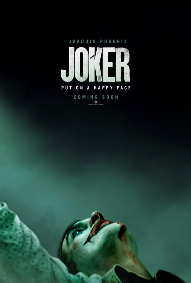
I chose this ‘Joker’ (2019) movie poster as my example of strong typography use. It is a psychological thriller that explores the narrative of a mentally unwell character who experiences mockery and bullying, and as a result, his mental health deteriorates, and he becomes a criminal mastermind better known as the Joker due to his clown appearance. This poster uses typography effectively to convey the dark, psychological tone of the film whilst having a visually balanced and practical design. The title text is aligned with the direction of the characters gaze, which naturally guides the viewers attention, creating visual hierarchy. The bold uppercase letters of ‘JOKER’ dominates the upper section of the composition which essentially creates a strong focal point which captures attention. The type has a textured appearance which adds depth and visual interest, playing into the theme of the movie and reflects the unstable and complex nature of the character himself. Despite its boldness, the typography does not overpower the image as only half of the characters face is shown which allows the composition to remain visually balanced and visually engaging.
The simplicity of the font choice and its sans serif appearance rather than serif prevents the design from appearing as too formal or decorative which further plays on the film’s dark and realistic tone. The supporting text is consistent in style but varies slightly in size and placement to create a flow. The use of the consistent colour palette joins the typography and background together which ensures that both elements are complementary rather than competing with the other. The overall composition is centrally balanced, producing a sense of structure that contrasts effectively with the chaotic personality of the Joker.
The use of the uppercase letters throughout adds a sense of authority which reinforces the film’s tension. Although the typography is plain, it works well with the muted colour palette and altogether, the composition of the alignment, texture, and typographic balance contributes to a powerful and visually engaging movie poster that clearly communicates the film’s dark and dramatic theme.
Dislike And Redesign
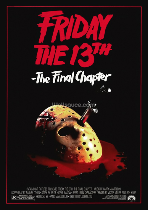
For my design that I did not like, I chose this poster of ‘Friday the 13th’ for multiple reasons. I felt that personally, I did not feel like the typography in this move poster design fit the theme of the movie itself, which is a horror movie that explores the story of a masked killer stalking and murdering a group of friends at a camp. For this reason, I felt that the chosen typeface could have been more horror-like and have visually illustrious elements rather than a regular, rugged typeface. As the original font looks too bulky and rounded, I decided that in my redesign, I would select a typeface that has a sharper or perhaps or a slender appearance that also supports the genre of the movie. I also felt that the ed appearance has been stretched a bit too far, as it’s a repeated colour throughout the poster (the blood, the boarder and the title) and because of this, a visual hierarchy could be introduced with the use of a different coloured typeface. The alignment of the text lies up centrally with the other features such as the imagery and other typography elements, which is similar to the Joker poster that I analysed, however, this poster feels too cluttered within the middle section of the poster.
My Redesign
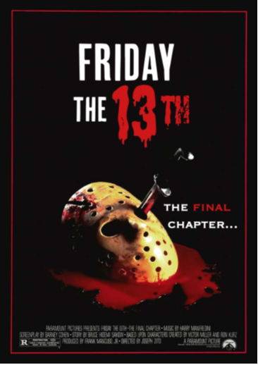
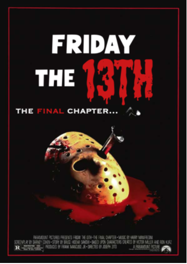
For my redesign, I experimented with typography that fit the horror theme, such as the dripping ’13’ in the redesigns. I also shifted the weight of the posters by moving the subtext from being directly below the main text, to being to the sides, which stops the design from being too central.
References
Joker Poster- Joker (2019) – Posters — The Movie Database (TMDB)
Friday 13th poster- MOVIE POSTER, FRIDAY THE 13TH: THE FINAL CHAPTER, 1984 Stock Photo – Alamy
Leave a Reply