Like
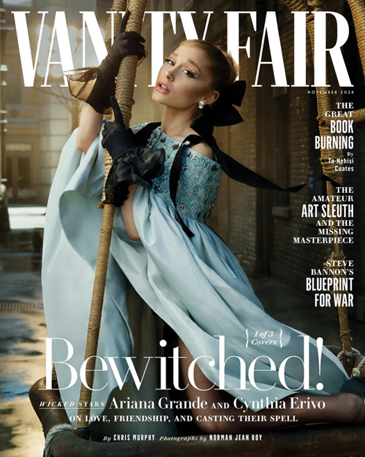
This Vanity Fair magazine cover is an excellent example of effective conceptual design, combining sophistication with modern appeal. The cover features Ariana Grande, a highly recognisable celebrity, which immediately captures attention and broadens the magazine’s reach beyond its traditional readership. While Vanity Fair typically targets a predominantly female audience aged 45 and above, this issue also appeals to younger readers, particularly Gen Z, by featuring a contemporary and culturally relevant figure. This strategic choice reflects the magazine’s ability to stay current and evolve with changing audiences while maintaining its established brand identity.
The cover concept draws inspiration from the film Wicked, which Ariana Grande stars in, and this theme is visually represented through both her pose and styling. Her elegant, almost ethereal costume evokes a sense of fantasy and enchantment, tying perfectly to the headline “Bewitched!” The visual tone is sophisticated yet imaginative, reinforcing Vanity Fair’s reputation for high-end cultural commentary while embracing a more creative and cinematic atmosphere.
Typography plays an important role in establishing the overall aesthetic. The serif font used throughout is formal and refined, creating consistency and a sense of authority. The typeface is slender and balanced, preventing the design from feeling overly heavy or cluttered. The hierarchy of text is also well considered, with the title “Vanity Fair” remaining dominant but still allowing the feature headline to stand out effectively. The spacing and composition ensure that the design feels clean and luxurious.
Dislike And Redesign
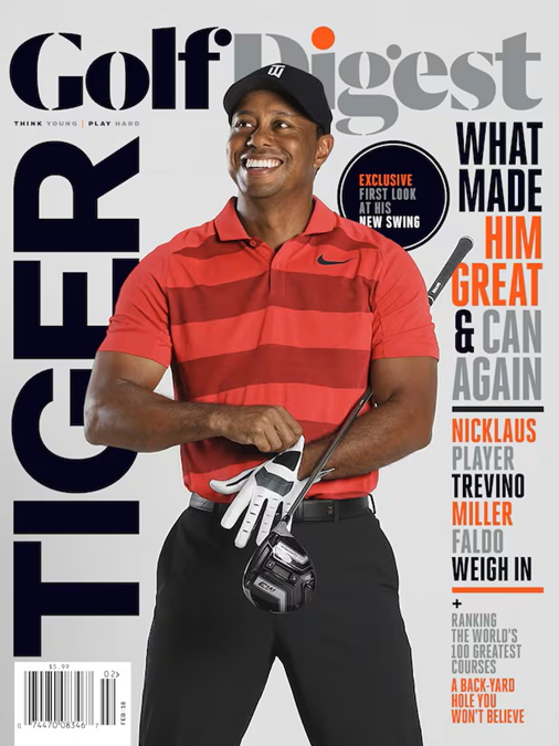
This Golf Digest magazine cover does not appeal to me due to its blocky layout and visual energy. The overall design feels inconsistent and lacks a strong sense of identity. The minimal colour palette, consisting mainly of pale tones and bright oranges , creates a flat and uninspiring look that fails to grab attention. The weak contrast between the background and the typography makes it difficult for the main headlines to stand out, which reduces the overall impact of the design. Although simplicity can sometimes work well in editorial layouts, in this case it results in a cover that feels lifeless and unmemorable.
The layout follows a very standard magazine style, offering nothing unique or innovative. The composition is dominated by a single, centred image that feels static and staged rather than dynamic. The pose of the model appears quite ordinary, which doesn’t convey movement, excitement, or the energy normally associated with sport. There is also too much type, particularly around the side sections, which leaves the design looking too heavy and cramped. The placement of the title feels squashed against the model’s head, suggesting a lack of careful planning in composition.
Typography is another weak aspect of the design. There is very little typographic variation, with similar fonts and weights used throughout. This makes it difficult for the viewer to distinguish between key points of information and gives the page a monotonous tone. Furthermore, there is no clear conceptual link between the visuals and the text. Overall, the cover lacks personality, creativity, and depth, resulting in a design that feels generic and dull rather than engaging or inspiring.
My Redesign
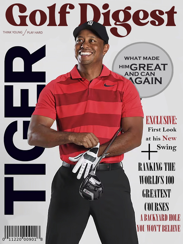
Within this redesign, I wanted to make the magazine cover less bulky on both sides as in the original design, the typefaces selected were all uppercase and sharp-edged which felt too formal, and I was also not a fan of the orange colour theme chosen as it felt too random. Because of this, I changed the variation of the type and also the colour choices. This made my design more informal, which fits the content more.
References
vanity Image- Ariana Grande on Vanity Fair Cover 09-24-2024 • CelebMafia
Golf Image- Archive | GolfDigest.com
Leave a Reply