Like
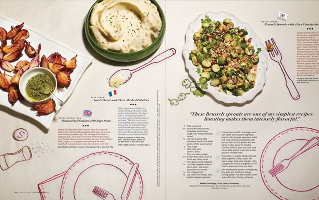
This magazine double page spread appeals to me because of its strong sense of visual flow and cohesion across both pages. The design travels seamlessly from left to right, creating a balanced layout that guides the reader’s eye naturally. This use of flow enhances readability and makes the spread feel like one complete composition rather than two separate pages. The combination of illustrations and imagery is highly effective, as it blends realistic food photography with hand-drawn elements to create visual interest and a playful, engaging tone. The drawn outlines around the food and utensils help to tie the images together, adding personality and charm to the overall design.
The use of varied text styles and colours adds to the visual hierarchy and improves navigation throughout the piece. There is a clear distinction between headings, subheadings, and body text, which allows readers to easily identify different sections of information. The mixture of bullet points and paragraphs introduces variety and prevents the layout from appearing repetitive. The wide range of colours used also contributes to a lively and dynamic atmosphere while maintaining consistency through a controlled palette that suits the food theme.
The spacing of the text is another successful feature of the design. It is spread out effectively so that the layout does not feel cluttered or heavy, allowing for comfortable reading and a clear presentation of information. Overall, the double page spread creates a fun and inviting atmosphere through its balance of imagery, illustration, and text. The way the visuals interact with each other makes the composition feel cohesive and well thought out, reflecting a professional yet creative approach to magazine design.
Dislike And Redesign
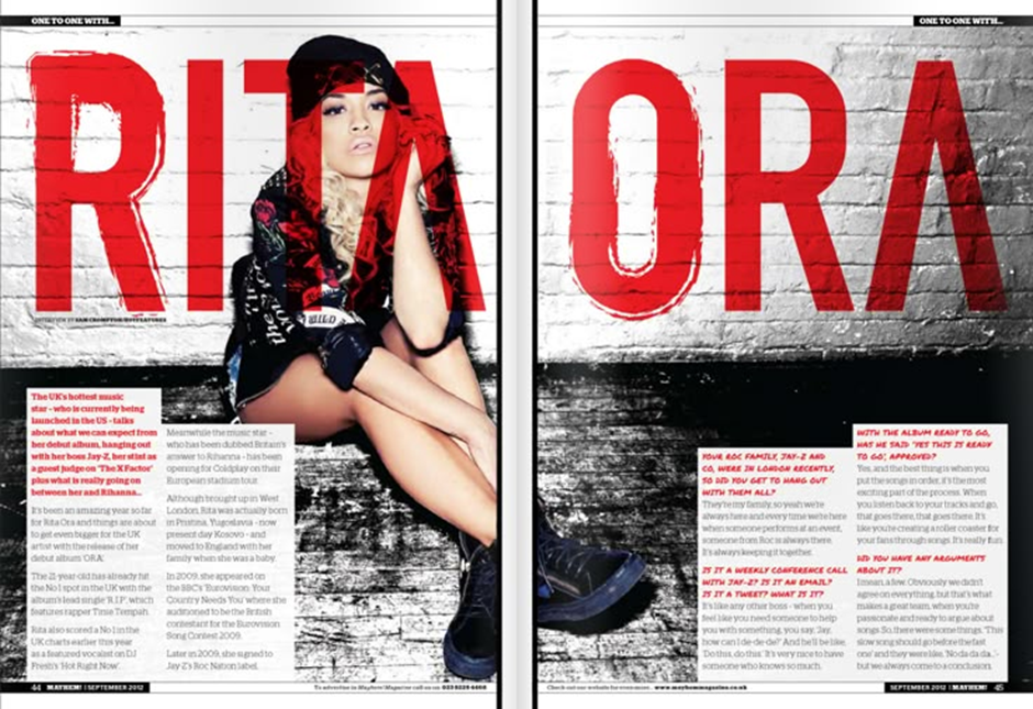
The double-page spread featuring Rita Ora tries to come across as bold and edgy, but overall, it doesn’t work very well as a design. The layout feels messy and unbalanced, with oversized red text dominating both pages and overlapping the image. This makes the spread hard to read and visually overwhelming. The imagery itself, Rita Ora sitting against a brick wall, fits her urban style, but the composition feels awkward, with too much empty space on the right-hand page. The colour scheme of red, white, and black is striking but far too harsh, creating a sense of aggression rather than sophistication or energy.
In terms of emotion, the design tries to be powerful and rebellious but ends up feeling forced. It doesn’t show much warmth or personality, which makes it difficult for readers to connect with her as an artist. The target audience is likely young adults or fans of pop and R&B music, but the spread doesn’t really speak to that group effectively. Instead of looking stylish or aspirational, it feels cluttered and outdated.
It’s also not very accessible. The large text in the background distracts from the main article, and the small, uneven text boxes are difficult to read. This makes it hard to follow or engage with the content. The message about Rita Ora being a confident, successful musician is lost behind all the visual noise.
If this design appeared in a magazine, it would stand out for its colour, but not necessarily in a good way. Culturally, it seems to be trying to link to urban street style trends, but it overdoes it and loses subtlety. To improve it, the designer could simplify the text, balance the image with a clearer layout, and use a softer, more modern colour palette to make it more inviting and easier to read.
My Redesign
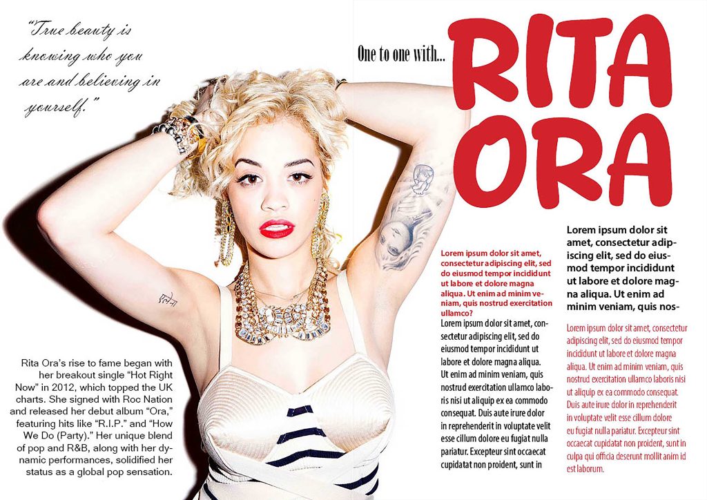
For my redesign, I wanted to take the overcrowded double page spread and simplify it to make the design more advanced yet balanced. Using Indesign, I strategically placed the type elements alongside the main image against a plain white background to reduce visual clutter. I continued the red type theme from the original design as I thought that it would also work well with the pop of the colour red in the image.
References
Food image- https://th.bing.com/th/id/OIP.f_y6KOJIaZ91ZTeWByanNwHaEo?o=7rm=3&rs=1&pid=ImgDetMain&o=7&rm=3
Rita Ora Image/ Design- Double Page Spreads – Assignment
Leave a Reply