Like

In “The Batman” poster, the colour choices are really striking. The mix of orange and black isn’t just for looks; it’s a key design element. Black gives off a classic dark, mysterious vibe, which fits perfectly with the Batman character. Whereas the orange is like a warning sign, hinting at danger and the gritty world of Gotham.
This contrast is super effective as it is. Orange and black are opposites, so they naturally grab your attention, making the poster pop. These grungy colours also relate to the genre and atmosphere in the movie, as it is a dark crime related movie. The colours support that feel, telling us this isn’t your typical bright and cheery superhero story
This poster has clear intentions of appealing to fans of darker superhero things such as crime dramas. The colours, the shadowy figures, and the “UNMASK THE TRUTH” line all work together to draw in that crowd. The pops of red also intrigues the audience as it draws a visual pinpoint within the poster as the main important elements in the design, such as the title, release date, and where you can watch it are highlighted in this colour which has been purposely done to draw attention to the important information. The poster does not lack visual appeal despite the three-coloured palette as the textured features ,such as the smoke and fire, adds tone variation which increases the overall atmosphere of the poster. By keeping the colour usage to a minimum, it has created a sleek yet intriguing design that perfectly reflects the atmosphere of the movie.
Dislike And Redesign
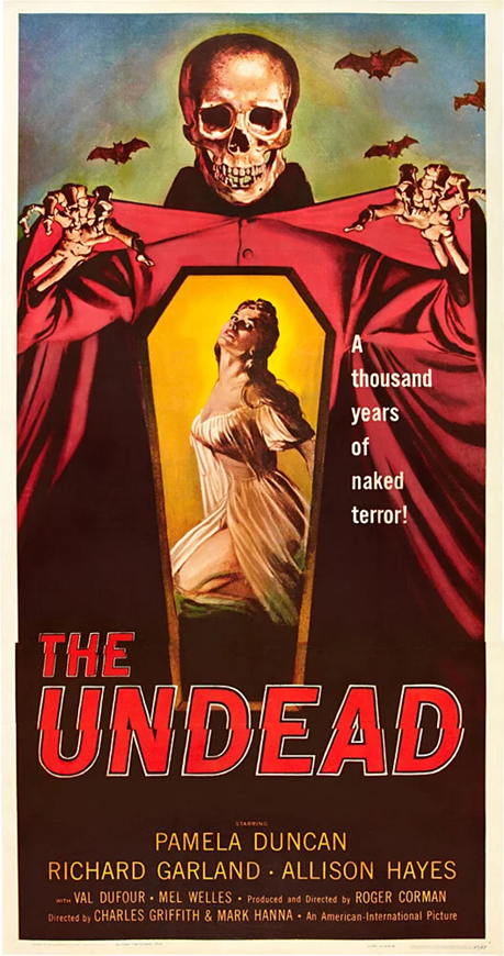
This poster for “The Undead” has got a bunch of different colours fighting for attention – the red cloak, the pale skin of the woman in the coffin, the dark background. Instead of creating a mood, it just feels messy and rushed. The colours don’t really work together to tell a story or set the tone for the film apart from the dulled colours.
The red cloak on the skeletal figure has been used as red is associated with danger, however, here it is clashing with everything else and looks out of place. It doesn’t enhance the horror like it’s meant to and it just floods the poster with a solid colour. Also, the overall colour palette feels dated and doesn’t give off the creepy, unsettling vibe you’d expect from a horror movie.
However, if this poster was to be less colourful, the black and white would give it a classic and timeless feel that reflects the old horror film more. The shadows would be deeper, the skeletal figure would look more menacing, and the woman in the coffin would appear more vulnerable. Plus, black and white would remove all the unnecessary distractions, allowing the key elements of the poster , the skeleton, the coffin, the bats, to really stand out. It would make the poster look way more sophisticated and genuinely scary, which is exactly what you want for a horror movie. It would appeal to its target audience a lot more and exaggerate the horror atmosphere that the movie is about.
My Redesign
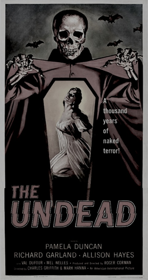
In my redesign, I simply reduced the saturation of the image to create this dulled-down version of the movie poster, which plays into the horror theme and exaggerates the atmosphere more than the original version as the colours were competing against the others so that they began to clash.
References
Batman Image- The Batman poster Stock Photo – Alamy
The Undead Image- the undead classic horror movie poster — MUSEUM OUTLETS
Leave a Reply